
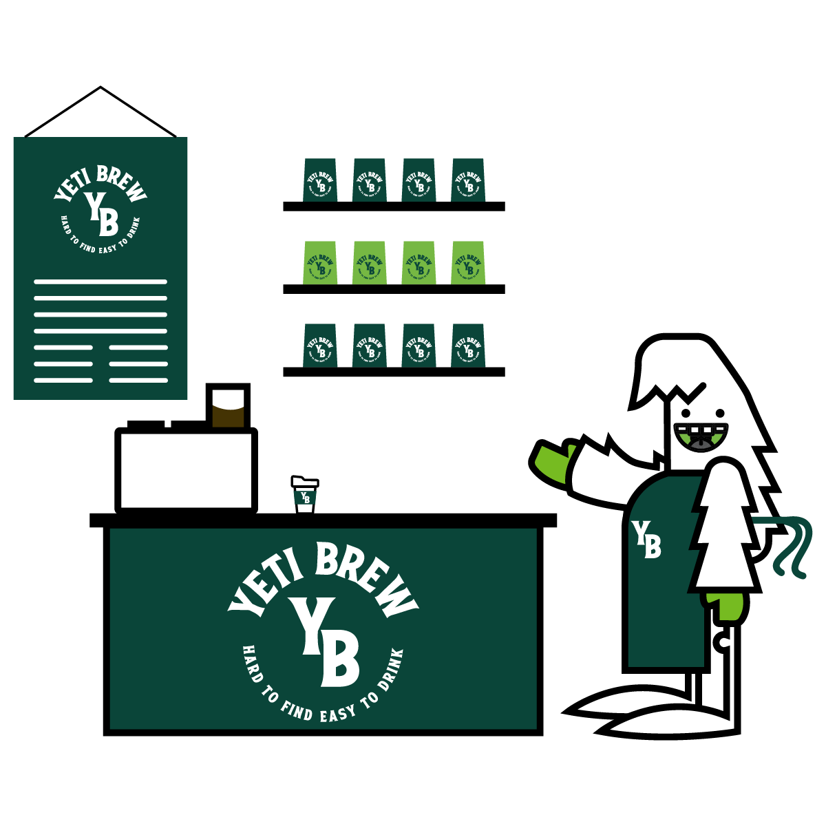
Promotional Products in Fredericksburg, VA: Turn Your Brand Into Something People Keep
Promotional products are everywhere—but only a few actually get used. For businesses in Fredericksburg, VA, branded promo works best when...
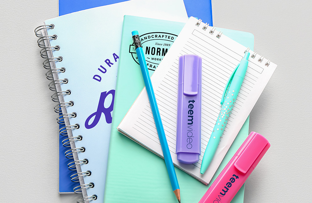
Custom Printing Services in Fredericksburg: What Local Businesses Actually Need
If you’re searching for printing services in Fredericksburg, VA, chances are you’re not just looking for ink on paper—you’re looking...

Printing & Promotional Products in Fredericksburg: How Local Brands Stand Out Offline
In a world dominated by digital ads and social media, printed marketing materials and promotional products still play a powerful...
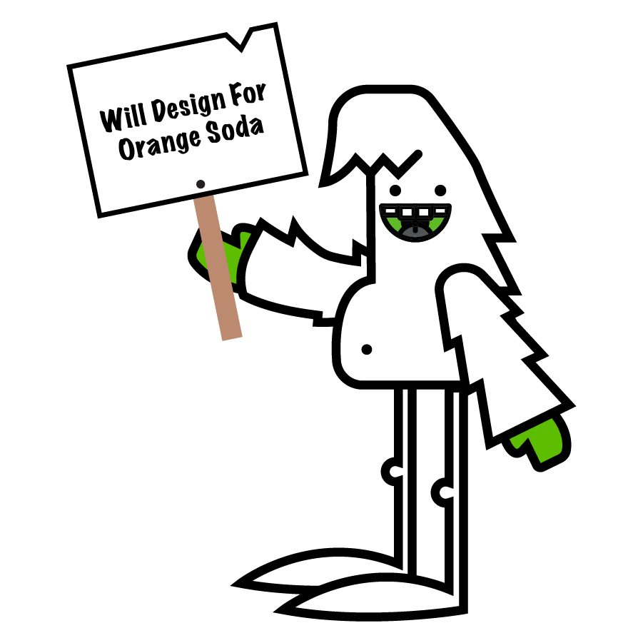
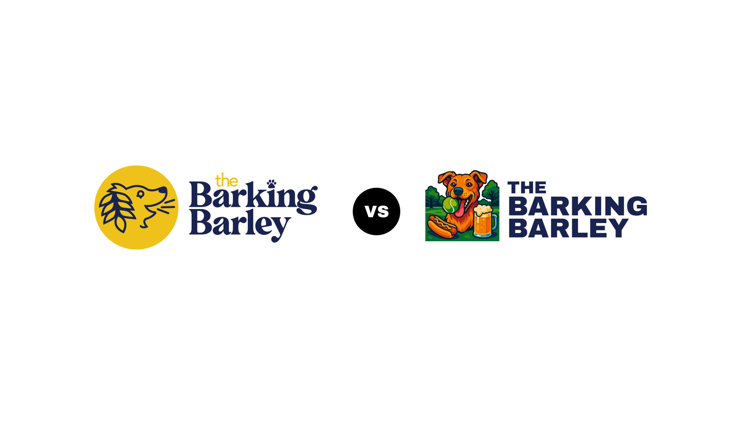
Why Simple Logo Design Always Wins (And Where AI Logos Fall Short)
Keep Your Logo Simple: A Lesson in Real-World Branding If you’ve been anywhere near branding conversations lately, you’ve probably seen...

Building a Trusted Digital Home for Obedience Kings Dog Training
Why a professional, strategic website matters for dog trainers in Fredericksburg, VA When Obedience Kings first approached Metro Nova Creative,...
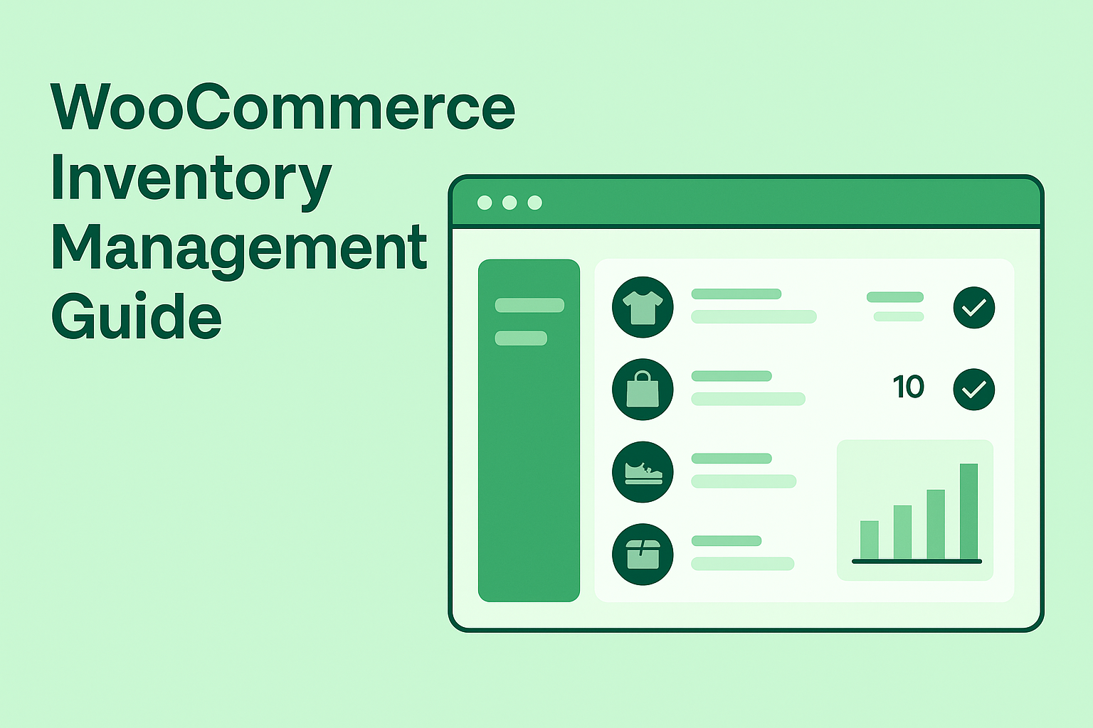
Inventory Management in WooCommerce: A Simple, Friendly Guide for Business Owners
Managing inventory in WooCommerce doesn’t have to feel overwhelming. In fact, with just a few clicks, you can keep your...
